Helios — Savings
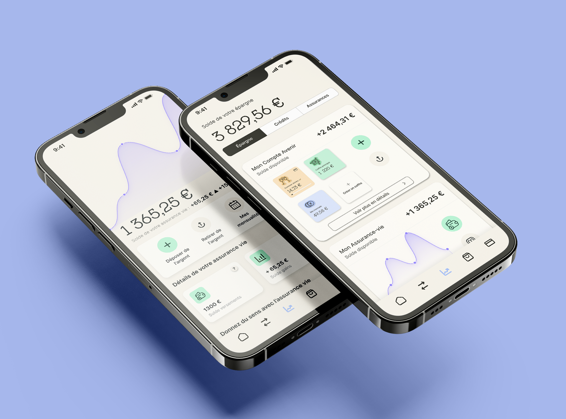
Helios, a french sustainable neobank, offers several savings products, each serving different financial goals. As the product offering grew, the interface struggled to communicate those options clearly. Users had difficulty understanding the differences between products and identifying the right next step.
- Role
- Product Design, UX/UI
- Tools
- Figma
- Year
- 2025
- Client
- Helios
The Challenge
The savings section lacked hierarchy, clarity and product visibility. Offers such as the Savings Account and Life Insurance were not sufficiently highlighted, and the path to account opening lacked clarity. The interface needed to surface the most relevant information, simplify navigation and help users move confidently from discovery to action without increasing cognitive load.
The Solution
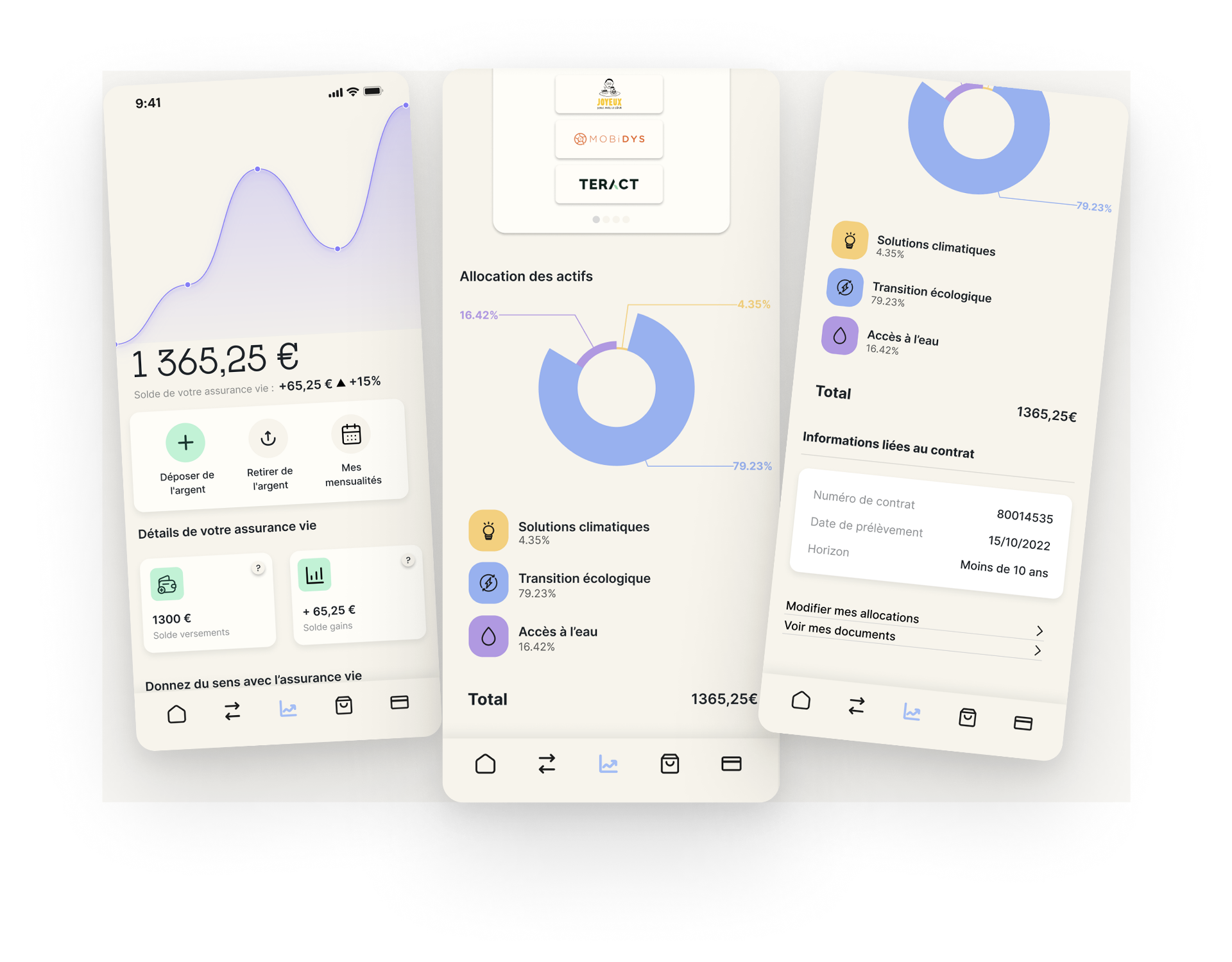
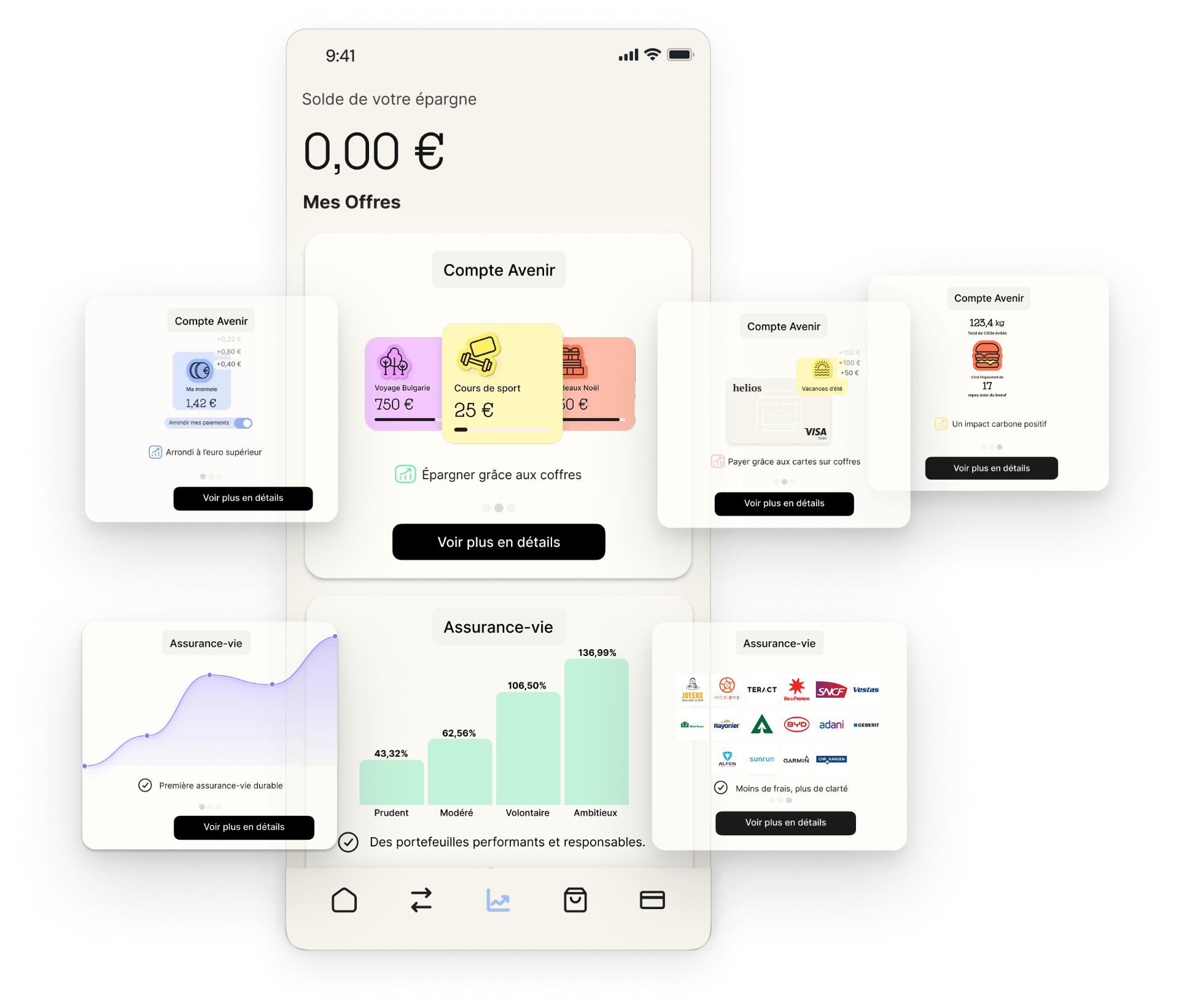
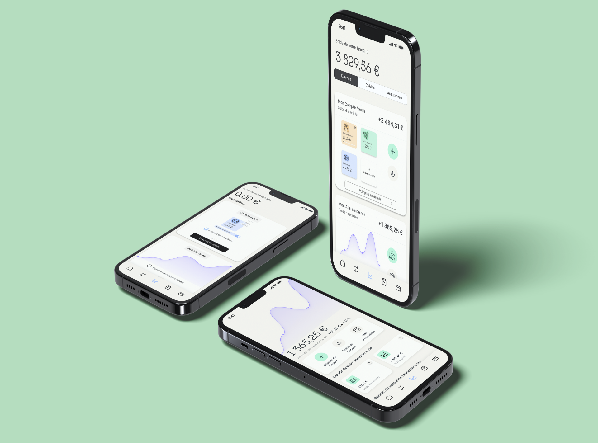
The information architecture was rebuilt around users' priorities rather than the product catalogue. Savings pockets became immediately visible, primary actions were brought to the top level and navigation was simplified to reduce unnecessary steps. The Discovery section was redesigned with a modular carousel, making each savings product easier to compare while giving greater visibility to Helios's investment offering.
The Redisigned Experience
A clearer, more intuitive savings experience where users can understand available products at a glance, compare their options more easily and access the most important actions in fewer steps.
"Clarity is the shortest path to action."
Morning Club